Mapping is a major component of the BART system, and is utilised within every module in some form or another.
Some of BART's main mapping and location functions include:

The following information relates to the basic mapping options available within the BART Team App. For more detailed information on specific mapping features, please check out the sub-category pages available.
Broadcast locations can only be viewed if there is a valid address attached to the broadcast. When there is a location, you will see a map preview from within both the ‘Quick View‘ and ‘List View‘ screens.
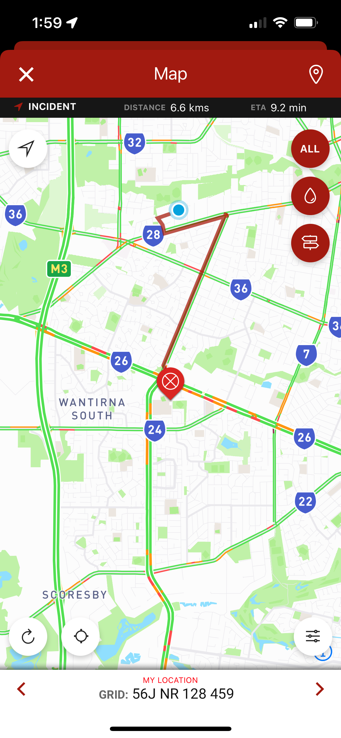
Tapping on the map preview will take you to the main interactive map screen. You can alternatively tap on the aqua map pin button within the incident:

The mapping layers within BART are provided to make finding helpful resource locations easy.
1. Tap on the resource layers icon in the top right-hand corner of the screen
![]()
2. A list of resources will appear; select a resource that you would like to view on the map
3. A new set of pins will appear on your map to identify the locations of the resource you have selected
You can toggle the routing for:
To do this, tap on the route toggle button:

Across the top of your map, you will find 4 quick access buttons:
1. Refresh – this button will force refresh your map
2. Water – this button will display all the water hydrant locations within your area
3. All – this button will display all incidents within your set marker radius
4. Directions – this button will prompt you to open up the directions from your location to the incident in a separate app if available:
To access the map options, tap on the map provided within a broadcast or select 'Map' from the main menu.
You will see a small options icon in the bottom right-hand corner of the screen:

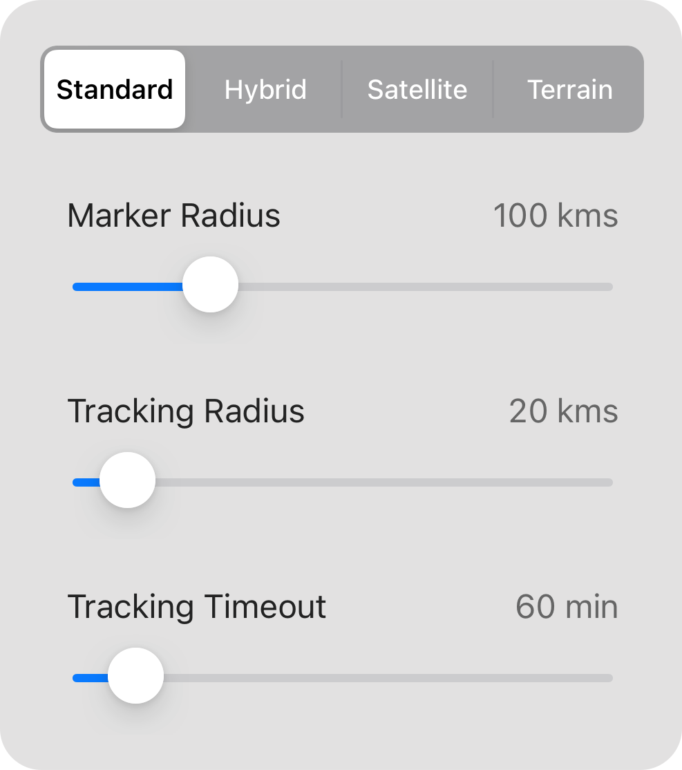
Tap on the icon to display the map options:

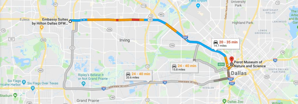
BART has integrated Google Maps to offer real-time traffic information.

The level of traffic congestion is displayed using a number of coloured lines:
The green lines on the map indicate that traffic is moving along well, at approximately 80km per hour.
Yellow lines on the map indicate that traffic is still moving steadily, but at a slower pace between 40 – 80km per hour.
The dreaded red lines on the map indicate that traffic is moving extremely slow, at approximately 40km per hour. Red lines can indicate an accident or major congestion on that route.
A red-black line on the map indicates extremely slow or stopped traffic.
If you see grey lines on the map, it indicates that there’s no traffic information available at the current time
Green is the fastest, and dark red means slow traffic. If you see red in most parts of the route, then avoid it and look for an alternative route.
Routing provides you with directions for transit. It also calculates your current or future travel times, based on real-time traffic.
To use routing, you will need an address. If no address was provided with the broadcast, you can enter it manually.
The marker radius is a setting that will control what distance you will see markers displayed, in relation to your current location.
The tracking radius is a setting that will control what distance you will see other people and appliances that area being tracked, in relation to your current location.
The tracking timeout is a setting that will control the amount of time that a member or appliance is visible on the map, after their last position.
We recommend a short amount of time for normal operations (ie. 15 minutes), unless you need to see the last known position of an appliance. In this case, you may want to extend this time (the max is 720 minutes).